Steps I Took to Redesign My Photography Website
My entire life I have bee a do-it-yourself kind of girl. Why would I pay someone to do something I could do? I just didn’t see the value. Fast forward a few years and I am kicking myself for not redesigning my photography website years ago. There is so much value in hiring other people. My family clients pay a professional for photographs so it makes sense that I would hire a professional to redo my website. And, honestly, I’m tired and what would have taken me months took the professionals days to complete.
All that said, I’m glad I waited until I was more established in my business. What was put together for me now would have looked completely different a few years ago.
-
Hire a Web Designer
Finding a web designer that you like, has availability and is within your budget is the trifecta. Hiring The Autumn Rabbit to redesign my photography website was a decision that I made back in November but there was a wait list until April. At first, I was disappointed that we couldn’t start right away but it actually gave me some time to think about what I wanted to create and say to future clients.
2. Read, Read, and Read
For months, I read business books. Anything that sounded interesting or was recommended ended up in my hands or on an audio podcast. While I know how to take a photograph, running a business is completely different and doing just a little bit of research helped me guide decisions.
3. Hire a Copy Writer
Writing is one of those tasks that I do but don’t really enjoy. It takes me awhile to express what I want to say and I’m self-conscious.. I really don’t like talking about myself but when you are running a very personal business you need to, and you need to shout out all of your accomplishments. Back in February, I started working with Amanda Grazioli. First, she sent me a questionnaire and then we sat down for an interview. She took everything that I was thinking and turned into the prefect copy. If it wasn’t for her I’d still be staring at my “About Me” page. She was able to take my thoughts about family photography being for the future to words. Even if you are a writer, as photographers, we are so close to our work that it is helpful having someone else read what you are writing who is not as familiar to see if our everyday terminology makes sense to other.
4. Videos
Not everyone needs a video but I really wanted to showcase what a session would look like so families could get an idea and not be scared. I can say that there is a lot of movement and they are fun but if you see it, the experience is different. For my videos, I worked with two different videographers – one for an in-home newborn sessions and the other for an outdoor session at a location I use a lot. By having one of the videos completed by the design date helped the designer incorporate videography into the website in a seamless way.
Amy Murgatroyd put together my family outdoor session video.
My in-home newborn lifestyle video was put together by Carlee Kettle.
5. Pin It
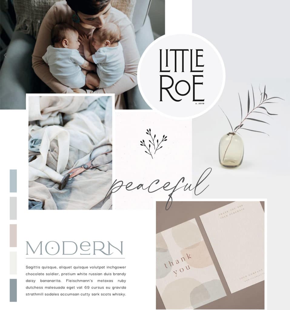
In all design, having a vision board is helpful to get a cohesive look and feel that you like. I probably should have started the process early. I remember sitting down with Sadie looking at different things and I ended up creating a board for her because she loved so many things that were completely different than what I liked. From my Pinterest vision board, the web designer put together a mood board that was used create the design and feel of the website and branding material.

6. Create a Portfolio
This was probably one of the hardest things, and one I wish I could outsource. Families invite me into their homes, share stories with me and I become attached to the photographs that I take of all of these people. It feels impossible to narrow down a collection to a handful of images. Marc, my husband, would constantly say “Are you still working on that?” because it just took me forever.
7. Putting it All Together
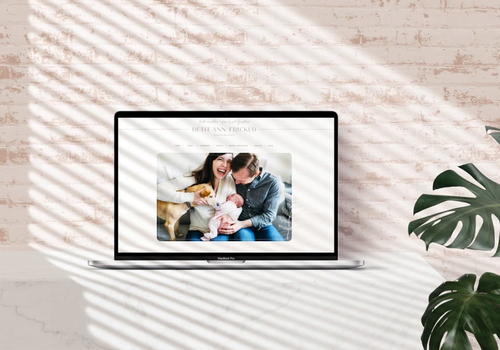
It was amazing to see all of the different components come together. I worked with Louise from the The Autumn Rabbit who was incredibly patient with me. For the longest time we couldn’t get passed what my branding look and feel would be but at one point she figured me out by saying she’d just work on the website. Having a visual of the final product allowed me to move forward and see what her vision was.
